Ready to finally invest in great design? Let's get started!

Johnson & Johnson needed a revamp of their current Supply Chain Dashboard to improve the efficiency, intuitiveness, and overall user experience


Johnson & Johnson
Remote
Lead Designer
Main areas of responsibility:
- UX analysis (flows and persona)
- Design (product, application)
- Hi-fi prototyping (user flow and interactions)
Figma
Miro
Looker
Tableau
PowerBI
August - October 2023
Johnson & Johnson's supply chain team was looking to re-vamp their internal Supply Chain Dashboard. Since Supply Chain itself comes with complex analytics, they wanted a Dashboard that was easy to digest, present, and export information.
The existing supply chain dashboard was not meeting the needs of its users due to it's overwhelming, bloated, and non-user-friendly design. Users are experiencing challenges in accessing and processing the vast amount of data and information presented on the dashboard, leading to increased frustration and inefficiency. The current design does not consider the users' goals or workflows, resulting in difficulty in performing essential tasks and identifying critical information quickly. Therefore, there is a need for a redesign that simplifies the dashboard's interface, reduces its complexity, and makes it more intuitive, user-friendly, and accessible to meet the needs of users, improve their experience, and increase their efficiency.

The objectives and goals for this project were seemingly straightforward. I wanted to define them as simply as I could since the overall architecture of the existing product was complex.
There were quite a few challenges during the entirety of this project, however, I was able to provide a completed deliverable despite them - which goes to show that even though there are *usually* hiccups in the design process, a seasoned designer knows how to navigate them in order to present a finalized product
There was very little time to get this project done, so I didn't have the luxury of being able to gradually progress through all of the typical design phases. Instead, I did a lot of bouncing around between stages (ideation to research, iterating immediately after feedback, and more)
This proved to be quite difficult when doing research prior to design. I had to talk to Devs to ask about my limitations/restraints when it came to certain platforms (Looker, Tableau).
The stakeholders primarily focused on what they didn't want in the new product vs. what they were looking for. Therefore, I had to strip the existing product of the pain points and then build from there.
Getting face-time with the stakeholders was tricky during this project. Since J&J is a huge company and they had other priorities, I had to learn to make each meeting streamlined, focused, and straight-to-the-point.
I conducted plenty of research on the existing Dashboard so I could make informed design decisions for the users going forward.
I first spent some time exploring the current Dashboard that users were seeing and interacting with on a daily basis. I walked through it and observed some of the “clunkiness” and “bloat” that stakeholders mentioned in our original discovery call.


The two platforms that I compared were Tableau (what J&J was already using), and Google’s Looker (since stakeholders brought this up multiple times in the discovery calls). They wanted this new dashboard to be a seamless combination of the two platforms and to compensate for where the other two were lacking.

I conducted face-to-face user interviews via Zoom to watch how users’ interacted with the existing dashboard. I asked them to perform their daily tasks and to call out any pain points while they were moving throughout the flow.
Questions asked during the recordings:

User insights gathered from the user interviews

91% of people said their main goals were:
1. Evaluate the current state of a product
2. Assess any urgent risk in the supply chain
3. Export Product Overview screens to add to reports

98% of people said their biggest pain point was:
1. Not being able to quickly find what their looking for

32% of people said the current dashboard does not fit into their current workflow
I conducted face-to-face user interviews via Zoom to watch how users’ interacted with the existing dashboard. I asked them to perform their daily tasks and to call out any pain points while they were moving throughout the flow.

The information architecture of this product was incredibly complex and changed very often throughout the design process. The stakeholders changed their requirements many times over, so it was definitely a challenge maintaining the structure of the information architecture when some of the existing requirements were no longer necessary, or some were added that weren’t originally mentioned.
That being said, I am only including the final IA diagram as the rest are trivial and not relevant to the final deliverable of this product.
Below is a high-level overview of how the ideal Supply Chain Dashboard would function. *Note: there were several different iterations of this flow, but for the sake of brevity, I'm only including the final approach.

Due to time constraints on this project, the stakeholders wanted to begin with high-fidelity mockups so we could get testing with users as soon as possible. Therefore, all of our iteration was done via high-fidelity mockups, which was unusual but proved to be successful for this project.


User feedback after testing / meeting with stakeholders:

User feedback after testing / meeting with stakeholders:

User feedback after testing / meeting with stakeholders:
This wasn't really an iteration but more of a test to see if we could keep all options at the top as a clickable nav bar and eliminate filters. This didn't end up winning the vote and was later archived.

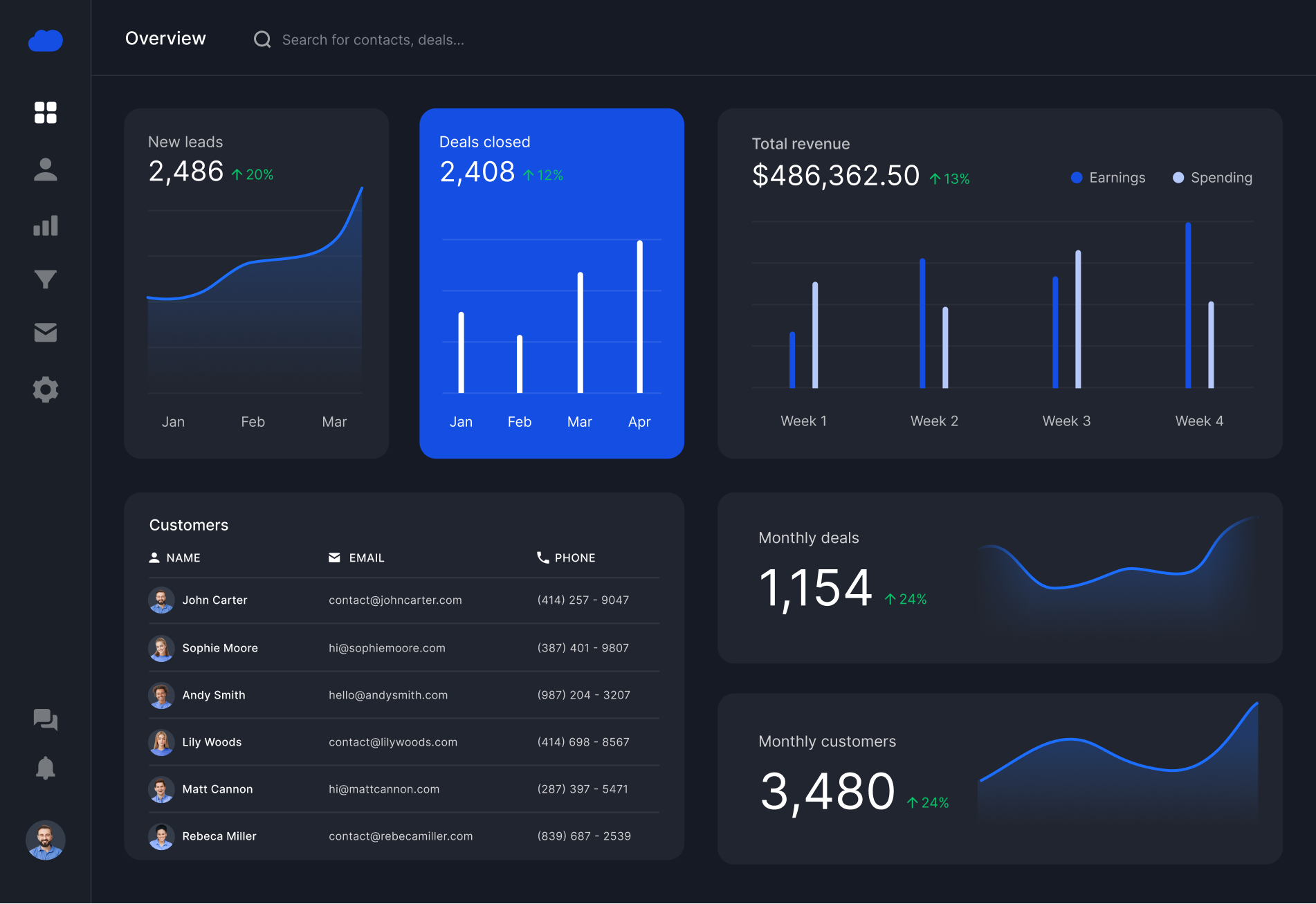
Below are some of the final screens for the Supply Chain Dashboard. *Note: real date was omitted in order to protect privacy of JJ business


